



Instagram is making waves online after giving its wordmark a major refresh, its first significant change in 10 years.
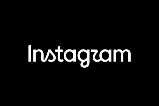
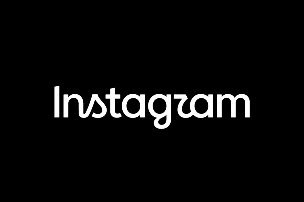
On Thursday (13 August), the platform revealed a new take on its familiar lettering, swapping the classic cursive-style wordmark for a look that feels “sharper and more modern.”
Instagram founder Adam Mosseri explained that “The wordmark at the top of the app hasn’t changed in 10 years, so it was time for a refresh,” describing the new design as “Cleaner and more modern,” while still drawing “references to the original” and the “simplicity and craft that’s always made it Instagram.”
The refreshed wordmark keeps Instagram’s playful curves but gives them a cleaner, more streamlined feel, particularly around the “s,” “r” and “g,” while the colourful camera icon stays unchanged.
The update goes beyond the logo, with Instagram also refreshing its fonts, animations, layouts and other elements across the app to create a more cohesive look.